Word is one of the most common sources for course files. If a Word document is created with accessibility from the jump, it ensures:
- Compatibility with Assistive Technology
- Ease of remediation if needed
- More accessible PDFs
- Compliance with institutional and legal requirements
- Improvements to your Ally Accessibility Score in Canvas
Below are common accessibility issues in Word and steps to correct them. Due to the shared interface experience across Office 365, many of these issues/solutions are also applicable to other Microsoft products such as PowerPoint.
Headers
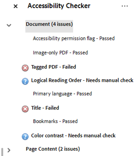
Headers provide structure for screen readers and help all students navigate content more quickly and easily. How do you know if a Word document has Headers? Click on View in the ribbon bar and then select Navigation Pane to find out. If your document has Headers, you should see the navigation structure of the document like this:
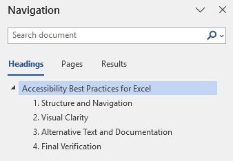
If the pane is blank, then it is time to add Headers to your document.
-
Begin by clicking on Home in the ribbon and then choose Styles. You will see a range of Heading options displayed.
-
Select the title of the document and choose Heading 1. Only use Heading 1 once in a document. For section titles choose Heading 2 and for sub-section titles choose Heading 3 and so on.
-
It is important not to skip Heading levels. That means that you shouldn’t jump from Heading 1 to Heading 3 or vice versa. Instead, documents should progress in a logical numerical order (either increasing or decreasing in scale), such as: Heading 1 to Heading 2 to Heading 3, and back to Heading 2, etc.
-
Each Header should be on its own line to ensure clarity.
Tip: Headings have pre-set default font/color formats. You can modify these by selecting Styles then choosing Create a Style and Modify. Change the font, size, color, etc. to meet your preference. Once done, check New documents based on this template so that your new Header style appears in future documents.
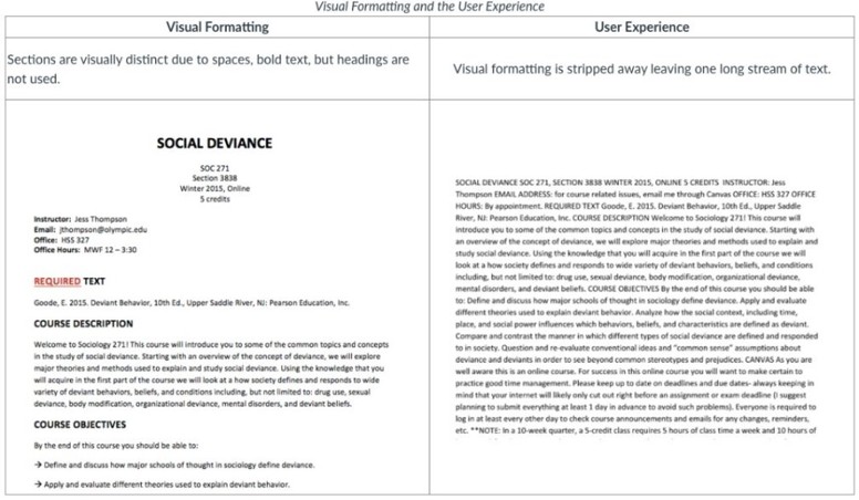
For an example of why Headers matter, see the following image. The document on the left has no Headers and has only been formatted through spaces and bold text. Without Headers, screen readers see the document on the right, stripped of formatting and presented as a wall of text. This is not an accessible document.
Alt-text
Alt-text enables users of assistive technology (screen readers, braille displays, text-to-speech tools, etc.) to access the meaning conveyed by images, graphs, and shapes in your course. Without alt-text describing their significance, students lack access to these key learning materials.
Adding Alt-text
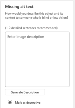
- Run the Microsoft Accessibility Checker to identify missing alt-text on images and graphics.
- Enter alt-text within the text field provided or right-click on the image itself and choose View Alt-text.
Tips for Writing Alt-text
Consider the “Three C’s” when writing alt-text. These are:
- Context: Why is this image here? A photo of a "maple leaf" in a biology course needs a description of its vein structure, whereas in a political science course, it might simply be identified as the symbol on the Canadian flag.
- Conciseness: Aim for 100–125 characters (roughly 1-2 short sentences). Screen readers can be cumbersome to navigate if alt-text is too long. If you need more space, use a "Long Description.”
- Content: Describe the information the image conveys, not its physical appearance. A description stating, "Graph with a red line going up” provides less useful information than one which says, "Line graph showing a 20% increase in enrollment between 2020 and 2024."
For STEM (and other complex) visuals, you can apply a two-part approach:
- Short alt-text descriptions for images/graphs.
Example: “Flowchart of the Krebs Cycle highlighting the production of ATP.”
- Long Description: Provide detailed data in the surrounding text or in a linked document.
Other types of content:
- For bar or pie charts, provide the raw data in a table format to ensure accessibility.
- Maps: Describe the specific geographic relationships or data being mapped (e.g., "Map of Europe in 1914 showing the Triple Entente in blue and Central Powers in red").
- Portraits/Bios: For faculty or historical figures, it is appropriate to say, "Portrait of [Name]." Only describe physical features (clothing, setting) if they are relevant to the person's role or the lesson.
- Test/Quiz Questions: Avoid "spoiling" the answer. If a student must identify a shape, describe its properties without naming it. Example: "An image of a three-sided polygon with one 90-degree angle." (Instead of "A right triangle.")'
Alt-text "To Do's"
- Skip "Image of": Screen readers already announce "Image" or "Graphic." Starting with these phrases is redundant and wastes the user's time.
- Punctuation Matters: End your alt text with a period. This tells the screen reader to pause slightly before moving on to the next section of text, which improves comprehension.
Contrast Issues
Beyond meeting the accessibility needs of students with visual disabilities, providing proper contrast also ensures that course materials remain readable in diverse environments, such as on a mobile device in bright sunlight or on a projector in a dimly lit lecture hall. In addition, high contrast reduces eye strain and cognitive load, supporting better focus and comprehension for all learners. Academic institutions typically aim for WCAG 2.1 Level AA standards. These are measured as a ratio of the brightness of the foreground (text) to the background:
Minimum Contrast Ratio Requirements for Digital Text and UI Elements
| Text Type |
Required Ratio |
Examples (on White Background) |
| Normal Text (under 18pt) |
4.5:1 |
Black, Dark Blue, Dark Green |
| Large Text (18pt+ or 14+ bold |
3.0:1 |
Medium Gray, Darker Oranges |
| Non-text (icons, buttons) |
3.0:1 |
Search icons, navigation arrows |
To ensure that your documents are inclusive, mind the following guidelines:
- Stick to the Automatic Font Color: In Microsoft Word, using the Automatic setting for font color is the best practice. It ensures that if a student uses High Contrast Mode on their computer, the text will intelligently invert (e.g., black becomes white) to maintain readability.
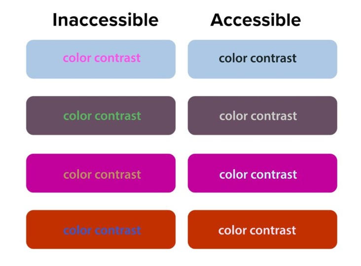
- Avoid "Vibrant" Combinations: Never use red on green, yellow on white, or light blue on white. These combinations are notorious for failing contrast checks and are often invisible to those with color-vision deficiencies.
- Don’t Rely on Color Alone: If you use color to convey meaning (e.g., "all items in red are overdue"), you must provide a second indicator, such a text label like “Overdue.”
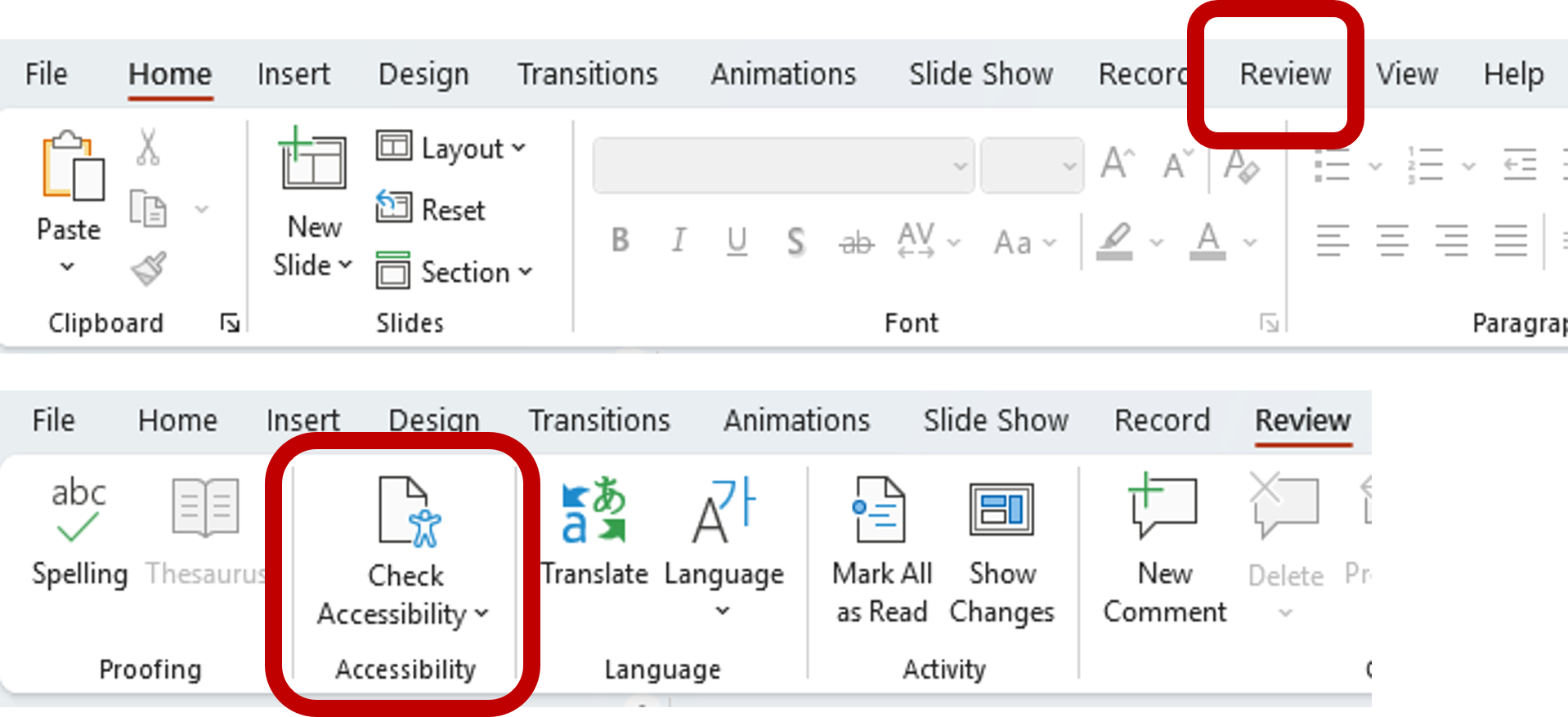
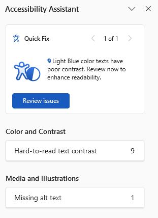
- Use the Accessibility Checker: Before uploading a document to Canvas or email, go to the Review tab and select Check Accessibility. Microsoft’s built-in tool will flag Hard-to-read text contrast and suggest accessible color alternatives.
- Mind Your Backgrounds: Avoid placing text over images, watermarks, or gradients. If you must use an image background, place a solid-color "text box" behind the writing to create a stable, high-contrast surface.
Contrast Issues in Graphics/Images
Contrast issues can also affect images, graphs, and illustrations. Refer to the following guidelines to reduce this accessibility issue.
- Try to avoid “scans of scans” when possible, to avoid image degradation (often an issue in PDFs). If an original version of the image/graph is available, use that instead.
- For charts, use vector graphics (SVG or high-quality PNGs) rather than compressed JPEGs.
- For images that cannot be improved (e.g. historical photos), provide a text summary below the image.
- Avoid text in images whenever possible.
- Use high-contrast color palettes when using images/diagrams against backgrounds.
WebAIM provides a free online color contrast checker if you are unsure if your document is accessible.
Tables
Creating accessible tables in Word (and other applications) is primarily about ensuring a screen reader can predict the "path" of the data. Assistive technology reads tables from left-to-right, top-to-bottom; if you break that flow with merged cells or complex layouts, the student can lose the context of the data.
When creating accessible tables, a few “Golden Rules” should be kept in mind:
- Use Tables for Data, Not Layout: Never use a table to create "columns" or to position text on a page. Use the “Columns” tool in the Layout tab instead.
- Keep it Simple: Avoid nesting tables (a table inside a table) or splitting cells. If a table feels too complex, it is almost always better to break it into two smaller, simpler tables.
- No Merged Cells: Merged cells are the #1 reason tables fail accessibility checks. They "blind" the screen reader to the logical relationship between a header and its data.
Making Tables Accessible
- Designate the Header Row (Two Locations Required)
To fully "lock in" a header row so it survives exports to PDF or Canvas, you must set it in two places:
- Select the table and click the Table Design tab. Then check the Header Row box.
- Right-click the table, then choose Table Properties. Next click on the Row tab and check Repeat as header row at the top of each page. Next uncheck Allow row to break across pages.
If you don’t perform these two steps, although your table will pass the Microsoft Accessibility Check, it will display a lack of table headers when scanned by Ally.
- Avoid Blank Cells
Screen readers may interpret a blank cell as the "end" of the table. If a cell has no data, type N/A, None, or No Data within.
- Add Alt-text
Right-click the table then choose Table Properties and select the Alt Text tab. Provide a one-sentence summary of what the table shows (e.g., "A table comparing 2024 and 2025 enrollment trends by department").
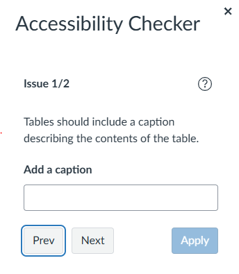
- Add a Caption
Right click on the cross icon on the upper-left corner of the table then select Insert Caption. This provides a visible title for the table, which helps all students navigate the document.
Descriptive URLS
When a URL is left as a raw string of characters, a screen reader will announce every single letter, slash, and dash, which is both confusing and time-consuming for the learner. Keep the following in mind when adding a URL into a Word document, PowerPoint, or email: Contextual Clarity:
- Descriptive link text (the words that replace the URL) tells a student exactly where they are going before they click. For example, "Download the 2026 Biology Syllabus" is much more useful than "Click Here."
- Short Links: Short links such as spscc.edu) can be used in addition to descriptive links, especially in materials that may be provided in both digital and printed forms.
- Screen Reader Navigation: Many screen reader users pull up a "Links List" to quickly scan a document. If every link in that list says "Click Here" or is a long string of random characters, the student has no way to distinguish between them.
- Visual Scannability: Even for students without disabilities, descriptive links make it easier to skim a document and find resources quickly.